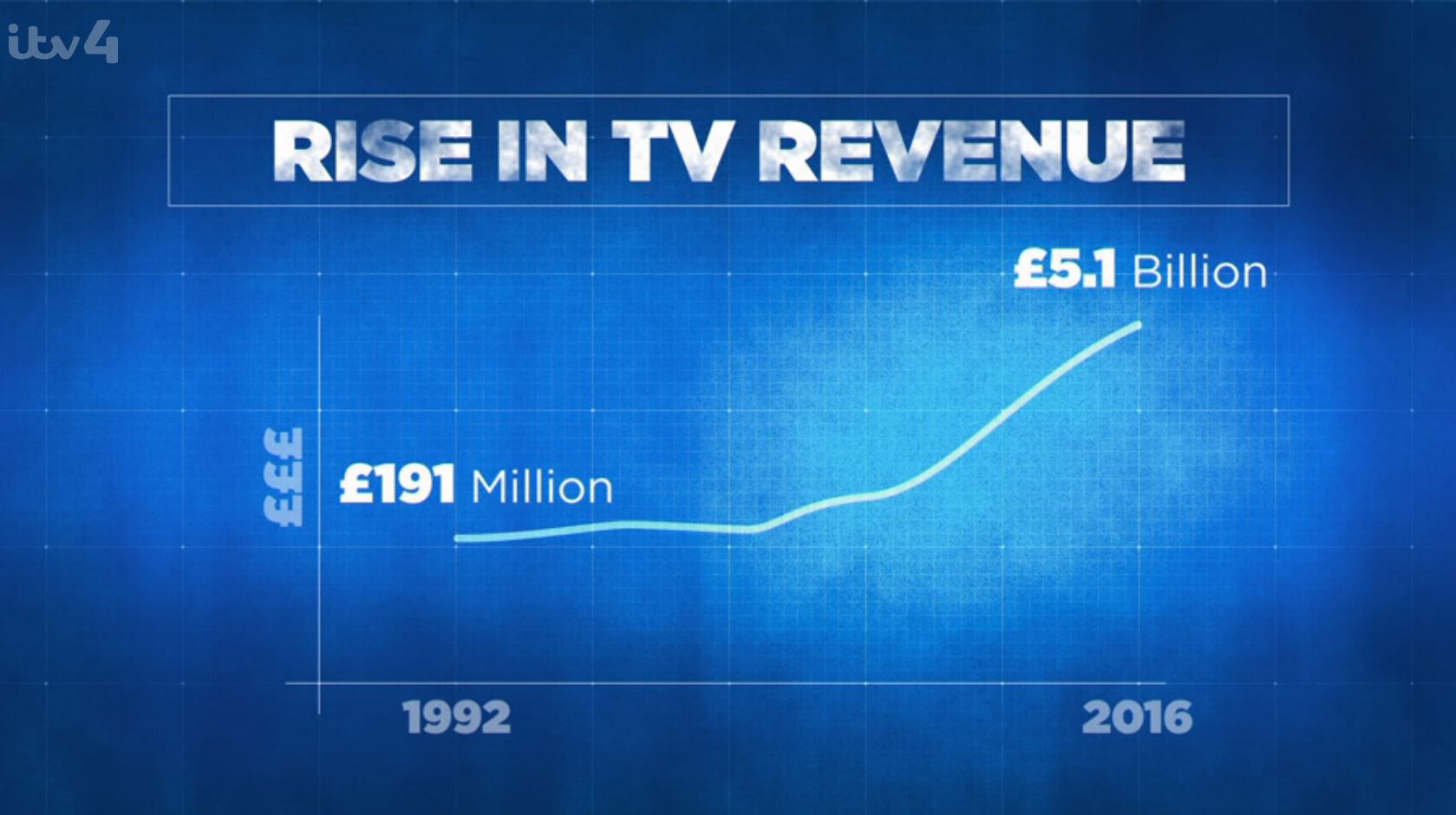
The chart above is screen-grabbed from an otherwise excellent ITV4 documentary called When Football Changed the World. It looked at the state of the game as the old First Division broke away to form the Premier League at the end of the 80s and start of the 90s. It interviewed plenty of key figures from the period both on and off the pitch.
At time of writing, it’s on the ITV Hub and is well worth watching. I’ve no doubt it’ll get a few more outings on ITV4 over the coming weeks and months.
But that chart is just dreadful for a couple of reasons.
The documentary was trying to illustrate the spiralling increase in UK Premier League costs over time. The first deal starting with the 1992/93 season was indeed worth £191m, and the latest beginning this season is worth a cumulative £5.1bn.
To put that in context, the latest deal is nearly 27 times the original deal!
Whereas, looking at the graphpaper-styled background this graphic is using, it looks like 5.1bn is about 1.5 times as big as 191m.
They’ve just not used a proper vertical scale on the chart. Revenues have risen extraordinarily, and this chart just doesn’t show it.
In fact, the chart should look something like this:
Just using proper scaling shows the quite stratospheric rise in rights.
But in fact, the value of the overall deal each time doesn’t really show the whole story. The first deal that started in the 1992/93 season was for 5 years, whereas since 2001/02, they’ve been for three years. So if we look at the rise in terms of cost per season rather than per deal, we get this.
Note that since the changes only really effect the first couple of deals, the charts look pretty similar. But the growth per season is actually 44x the price of the first Premier League deal rather than 27x if you consider each deal in isolation.
The other thing that has changed is the number of matches covered by each deal. Basically the number of matches under each deal tends to increase over time. And that does mitigate some of that inflation. The first deal saw each Premier League fixture costing Sky about £600,000 each. This season, on average games cost £10.2m each. Again, it’s a massive jump, but it’s 16x the first deal’s cost, which goes some way to mitigate the 44x increase in rights costs per season.
I think the per season chart is the fairest though. This represents the real amount going into the game from TV companies. And to the clubs, looking at their much healthier bottom lines, that’s what matters.
Note: I’ve tried to use the widely reported values of each Premier League TV deal, but the 2001/02-2003/04 deal in particular seems a little opaque with some conflicting numbers. More recent deals are widely reported because they have a material effect on PLC’s bottom lines.