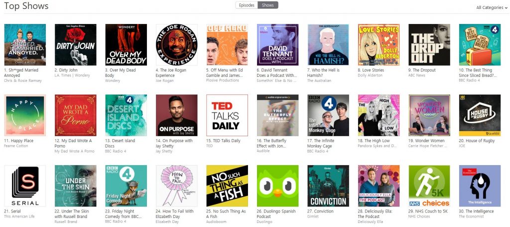
It appears that Apple’s podcast charts are somewhat broken. Or specifically, they had been broken for a period of time over the weekend while Apple perhaps tried a new algorithm to rank podcasts.
Behind the scenes we know that various bad actors have been attempting to game the system. In the same way that you can buy Twitter or Instagram followers, you can pay some dubious third party to push your podcast up the Apple chart. This might get your podcast, briefly, towards the top of the charts allowing you to boast that you are/were the number one podcast in whatever category. But those listeners aren’t real, and your podcast is likely to fall away pretty quickly again too.
In the last couple of days, a number of people have been asking big questions surrounding this.
- James Cridland wonders what Apple’s chart should be replaced with.
- Nick Quah wonders whether any of this even matters.
Both are well worth reading, and here’s my take on the situation.
Let’s start with the hypothesis that charts are a good thing. They inform users about what podcasts other people are listening to, and they let everyone in the podcasting community see how their podcasts are doing against their peers.
Except that we know that Apple’s charts have never actually shown either of those things.
For the most part, a chart that simply displays who gets the most downloads/listens would be incredibly static. The same big podcasts would probably appear in roughly the same order week after week, month after month. Maybe one would drop down a little when it was between series, and occasionally a new hit would emerge. But basically the chart would be static. For a chart to be interesting, there has to be some dynamism.
From a consumer perspective, a mostly static chart is boring. The consumer is never going to find new podcasts to listen to, and so they’re unlikely to even have further looks at the chart once they’ve realised that there are few changes between editions.
Apple currently uses some kind of ‘new subscriber’ algorithm to determine its charts. Recency counts for more than long-term listeners or subscribers. (Other digital charts do similar things. The bestsellers on Amazon are collated on perhaps an hourly basis to keep things interesting there too.)
The other key part of this is that Apple is seeing its position in the podcast ecosystem decline over time. Spotify, for example, is opening up significantly to podcasts – no longer caching them and properly serving them. They’ve just opened their platform up to everyone and they’ve become a fast growing #2 platform. They’re still a long way behind Apple, but they have an upward trajectory.
And Google is ‘doing’ podcasts more seriously now. They’ve not quite got around to pre-installing a true standalone podcast app on every Android device as Apple does. But they are moving in the right direction, and with the emergence of ‘Voice,’ podcasts become ever more important.
Both of these should mean that we’ll see a broader platform of iOS and Android devices being used to listen, more closely reflecting the true device ownership model. (Incidentally, that might also mean a change in the kinds of podcasts that are being made. Think beyond someone who can happily spend $/£1000 on a smartphone.)
Apple currently accounts for perhaps 55%-60% of the podcast market today, but that’s already considerably down from where it once was. To be clear, it’s not because Apple users are not listening any more, but there’s more diversity in the podcast platforms available, and in the main because Android was – and still is – under-represented.
Is Apple Still Important?
If we assume that Apple’s market dominance of podcasts is diminishing – albeit from a lofty position – then we also need to consider that any chart created by Apple is not actually representative of the whole podcast ecosystem. It’s entirely likely that we’ll see their share fall to below 50% in many markets.
In some countries, like India, the iPhone represents a tiny fraction of the overall smartphone user-base. So in fact, while Apple’s podcast chart for India might be indicative of podcast listening there, it might also be very unrepresentative, perhaps more describing what only the very wealthiest couple of percent of Indians are truly listening to.
If we’re going to have a chart, then it needs to be wider than simply Apple’s share of the ecosystem, otherwise it’s going to be biased towards the people who own iPhones. And newsflash – that’s really not the population at large.
And then we run into the problem of how charts are created anyway.
How should a podcast chart be measured?
There are two major ways to find out what’s happening in a population: census or survey.
Apple has effectively been providing a census of its users. In other words, it has data that shows how all Apple users are consuming podcasts. A census sets out to measure everyone within a specific population. The results should be very accurate, but it can be hard to collate all that data, particularly if it comes from multiple places. It’s not for nothing that the UK population census only takes place every ten years. It’s a big and expensive undertaking.
Under the census chart model, you need to get accurate data from everywhere. In the podcast world, this means either approaching every podcast creator and asking for their server data, or approaching every podcatcher (i.e. all the podcast apps), and getting data from them. Neither is likely to be achievable. Herding cats comes to mind.
In the US, Podtrac has attempted the census method, embedding code into feeds to route requests through its servers. But only podcasts who choose to be measured on this system have their data captured. That tends to mean big US groups. But even then, there are some missing, choosing not to take part. Non-US podcast creators that might have sizeable listener-ships within the US are often missing too. It is by no means a complete picture of the US podcast listening market.
For a chart like this to work and for it to be truly representative, you need everybody on board, agreeing to a methodology, and being able to adopt the technical requirements that lead to measurement. It only takes one major group to choose not to play, and the chart is wrong.
Meanwhile, other tracking ideas are being posited using pingbacks, but they can be defeated by podcatchers that don’t play ball, and again require many parties to get on board.
Don’t forget that different groups very different business models. So they might not need to agree to a central methodology.
The other key way to measure is the survey option. In this case you use a subset of the podcast listening population, and get them to agree to being essentially monitored to see what they listen to. Companies like ComScore do this in the digital realm, while broadcast ratings bodies commonly use this kind of measurement to deliver television and radio ratings.
As long as your sample is big enough, then you can say with a high degree of certainty that your results are fairly accurate.
This would seem to be the more achievable model. You don’t need the direct participation of either podcast creators or podcatcher apps. Indeed, anyone could do it.
But of course there are problems. There’s the cost for starters. You will need to employ a company or people to do this for you. Then you need to persuade members of the public to agree to let them be measured. They may well say yes, but they’re also quite likely to want some kind of incentive: cash or other benefits in kind.
Next there’s the size of the sample, and the level to which you want to measure it. If there were only two podcasts in the world, then perhaps a 1,000 people might be enough to say with a high degree of confidence, how much one podcast was being listened to versus another (In fact, the sample required would depend on how similar or different their listening was. If the podcasts are very closely matched, then you need a bigger sample). Political polling often works like this, and of course it’s easier to poll when there are only two parties than when there are three, four or more. If the polls are tight, then a bigger sample is needed to determine who is actually ahead.
In a world where there are hundreds of thousands or perhaps millions of podcasts, then depending on how far down the list you want to accurately measure them, your sample gets bigger and bigger. In the UK, to measure broadcast television, a sample of around 5,500 homes are measured. That means that the top performing programmes are quite accurately measured. But I wouldn’t trust the ratings for a programme that airs on a smaller non-mainstream channel. Indeed those channels don’t use programme ratings themselves so much as overall channel shares. The sample size for a given programme might be based on just a couple of viewers and that’s just not statistically significant. In other words, the census model breaks down when you stray beyond the bigger podcast, unless your sample grows quite substantially.
It’s also worth saying that you can take a combination of census and survey to create a hybrid model for your chart. You collect data from those podcast creators who agree to it, and mix it with survey data for a wider picture of the overall market. UKOM, the UK digital’s audience measurement body uses a hybrid approach.
Before we settle on a methodology for our post-Apple chart, we need to answer another question.
What are podcast charts for anyway?
Charts have historically been about both capturing a cultural moment, but are also an exercise in marketing. When we look at music, film, book or game charts, it tends to be a combination of them both.
We might use the charts to measure the taste of the nation. Lots of people are loving this song, or seeing that film. That’s really useful to know. And what’s more, if lots of people are loving that film, maybe I should see it? For a recent case in point, see The Greatest Showman, which spent a remarkable 18 weeks in the UK Box Office Top Ten. While a lot of that was delivered by repeat viewing, and both word of mouth and wider marketing helped, the fact that the film reached number one in its sixth week of release is unprecedented in recent times. The film’s position in the box office top ten became part of its story and drove people to the film.
These days the UK Top 40 isn’t as important as it once was, but when Ed Sheeran managed to get 16 songs into the top 20 at the same time, it became a story.
Beyond that, they’re also essential barometers for the industry. While some players might attempt to juice the system – releasing films earlier in the week to create long opening weekends, or in times past, releasing multiple remixes of songs to keep fans buying and keeping a song at number one – they inform creators about what’s selling and what perhaps they should be making in future.
And if everyone else is reading a book, seeing a film or watching a TV series, we can feel that we’re missing a part of the cultural zeitgeist if we’re not doing the same.
In the podcast world, charts have been designed in part with both of these things in mind. How is my football podcast doing against my competitors? And what should a listener choose to listen to next?
In fact, Apple’s iteration of a chart was pretty bad at the former. A new podcast might get a blast of heat as it gains traction amongst listeners, but because the chart was skewed towards new subscribers, you couldn’t really tell how well your podcast was doing against a competitors. Even today, many podcast creators spend a lot of time listening out for snippets of information dropped at conferences or in published articles, because there’s no real information out there in the public domain. “Serial got how many downloads with it’s first episode?”
It’s also not clear that podcast charts have really helped listeners to discover new podcasts. Older podcasts with big listenerships might not sit high up the rankings, hiding their popularity, while newer podcasts might flame brightly in the charts. Mid-size podcasts might be hidden altogether.
Almost certainly the most powerful points of discovery for podcasts are those editorially picked slots in apps like Apple Podcasts, and word of mouth. (The other key way to let listeners discover your new podcast is of course, to pop it into the feed of one of your already popular podcasts. But only the bigger players can do that.)
So what should a podcast chart look like?
I’m not sure there’s a simple answer to this. For many in the podcast creation community, an accurate set of metrics that lets one company compare its performance with other companies’ would be very useful. That’s the kind of information that might help advertisers. While undoubtedly advertisers are getting this information behind closed doors, there are still question marks about how one company measures its numbers compared with another’s.
You only have to look at the various different ways ‘video views’ have been measured by say Facebook and YouTube. Facebook has 3-second, 10-second and 100% metrics; YouTube prefers 30-second counts, but also provides metrics on 25%, 50%, 75% and 100% completed videos. How do you compare video performance on the two platforms?
A podcast chart would create a comparative measure between different companies; the measurement methodology would be consistent.
But this community probably just wants a straight count. How many downloads (or better yet, listens), did every podcast get in a particular week or month? Just rank them all, with rankings for sub-categories. The data might form the basis of a generally used currency by which podcasts are monetised.
From a listener’s perspective, a straight ranking like that would not be useful. I suspect that a methodology closer to Apple’s is more interesting. The UK music charts have had to fiddle with their methodology quite a lot since subscription streaming services like Spotify came along and were added into the mix. Because Spotify is both used to listen to new music (akin to buying new tracks), and as your music collection (akin to listening to your older music) then they face the ‘problem’ of older music regularly cropping up in the charts because it’s Christmas or whatever.
In truth, both an overall chart and a chart of ‘breaking podcasts’ would probably both be of interest to a wider community of listeners. If we posit that the purpose of the chart is in part to aid discovery of new podcasts, then we need to consider both bigger and newer podcasts.
There needs to be two charts.
So we’re really talking about two key issues within the podcast industry – measurement and discovery. Measurement is key for trading and selling advertising, while discovery is still one of the biggest issues that is limiting podcast growth.
While discussions are ongoing in many marketplaces, most territories do not have a consistent agreement about how podcasts should be measured (Sweden is perhaps the exception).
In the meantime, podcast discovery is still akin to going to a bookshop that for some reason only has about half a dozen books out on display, with the remainder neatly lined up with only their spines showing from the shelves. Meanwhile a potential reader who doesn’t know much about books, but knows they want something to take on holiday, is being told: “Go on! We’ve got thousands of books in here. Just pick a couple!”
The bookshop’s top ten, meanwhile, is made up of The Bible, The Highway Code, a dictionary and The Da Vinci Code amongst others. All indubitably best-sellers, but…
Apple’s charts are flawed today, and they’re going to continue to be flawed. They’re neither fish nor fowl, and that’s not altogether their fault.
We probably need a couple of different types of charts, but precisely who does the measurement and what kind of measurement takes place is not a simple question to answer. But we probably do need to answer that question.