
Last year BBC Four broadcast a wonderful one-off programme called The Joy of Stats. It featured Professor Hans Rosling who’s talks at places like TED have made him extremely popular and watchable.
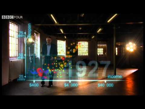
In particular he’s been employing a type of motion chart that’s really useful for observing multiple pieces of data over long periods of time. His work in population and developmental statistics means has resulted in something called Gapminder that allows you to examine various datasets that Rosling has captured.
Incidentally, the entire Joy of Stats programme can be watched on that site and is well worth an hour of your time.
Anyway, that got me thinking: there must be some kind of dataset that I could shed some light on using these techniques. RAJAR was the obvious example. But could I get hold of Rosling’s software for my own use? Gapminder only lets you examine pre-selected datasets. It was easier than I thought, because it turns out that Google has something called the Motion Chart Gadget based directly on the software Rosling had used.
Once I’d wrangled the data into some sensible kind of order, I eventually came up with the following:
So you know what you’re looking at, the x-axis is the average age of a listener to that station (based on hours), while the y-axis displays the percentage of listeners who are male (as a decimal in this instance; 0.7 = 70% male). So a station in the top right-hand corner would be an elderly male station, while a station in the bottom left would be a young female station.
The size of the circle is related to that service’s listening hours. But all these things are user-changeable.
A few things to note:
- You really need to play with a big version of this. It’s much easier to view.
- To get started, hit the “Play” button in the bottom lefthand corner. You can also “scrub” the timeline by dragging with your mouse.
- There are stations missing. It’s largely based on current “national” services and groups. In particular stations that have “been and gone” aren’t included. Even then, I’ve still not included absolutely every current service.
- Note that figures are all based on 6m weighting when a lot of the services would ordinarily report on 3m weighting. But some of the groups do report on 6m, so I’m using the “lowest common denominator” here. There’s a good argument for mixing 3m and 6m weights however.
- I’ve essentially ignored the various takeovers and mergers that have happened between groups. So “Global” goes right back to 1999.
- Some station definitions have changed over time. For example, Capital Network is very new, and Heart Network today is something very different to what it was five years ago as its composed of many more individual services.
- The chart is full interactive, and you can trace stations’ shifts and movements.
- Stations in the same groups are the same colour.
- You can turn trails on for individual station selections and see their shifts. Selecting services dulls the others.
- You can change what data is plotted by clicking on the x-axis, y-axis and size dropdowns.
- There have been a couple of minor methodology changes over time that this chart overlooks.
- If none of this makes sense, watch one or more of the Rosling videos linked to above.
The default state is based on a chart that I’ve used at work, but there’s more data in there, so you might want to look at the data differently.
Finally, you really will find it better if you use a larger version of the chart. I can’t emphasise this enough!
If you have any thoughts or comments (or even corrections), please let me know in the comments.
Source: RAJAR/Ipsos-MORI/RSMB
Disclaimer: I built this interactive view using data that I was able to get from my employer, Absolute Radio, and the overall design is based on static charts that I’ve produced for them.