There’s a really interesting piece to write about Taylor Swift, Spotify and iTunes revenues, and the music industry in general.
But this isn’t it.
I’m writing this because TechCrunch has an interesting piece about European Spotify earnings overtaking iTunes earnings.
The piece reports that Kobalt, a publishing company that collects music royalties on behalf of its clients, is collecting more revenues from Spotify now than it is from iTunes – the first time this has happened. Whether this is specific to Kobalt’s clients or is indicative of the whole industry in Europe isn’t clear. But the story it itself is highly relevant.
The story’s point is illustrated by the following chart:
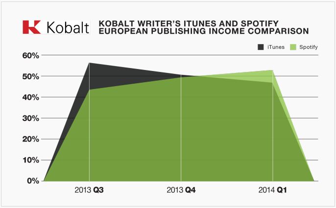
Source: TechCrunch
This is a terrible chart.
Here’s why:
Kobalt has been trading since 2001, but this chart very much suggests that Kobalt was collecting precisely no revenues from iTunes or Spotify prior to Q3 2013. This is very unlikely. The chart also suggest that iTunes and Spotify revenue has fallen off a cliff post Q1 2014. This is also very unlikely.
Essentially this chart has six data points, and it shouldn’t have been presented using an area chart like this. Personally I think a simple bar chart would have sufficed. As it stands, this is grossly misleading.
Here’s a second chart in the piece:
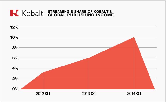
I think this might be even worse. It certainly suggests that in the period prior to Q1 2012, Kobalt’s share of publishing income was zero. I suspect that was not the case – it’s something that has probably been growing over time given the age of the company and the fact that Spotify has been around since 2008 and had 10m users in 2010.
And again, it also suggests that by Q2 2014, their revenue share had plummeted to zero. Whereas I suspect that they’re a growing business. This is just another really bad chart.
Seriously, if you can’t do charts properly, just publish a table. There are three numbers in this chart, and charting them like this is simply useless.
Just because your graphics package lets you publish some data in a funky visualisation, it does not mean it’s right for the data. Visuals should help tell your story, not distort the data and ultimately misrepresent it.