Over the past few days, Google has been pushing users to try running its Test My Site With Google service. In particular, it’s trying to help sites see how mobile friendly they are.
I dutifully entered the details of this site, and waited for the report.
I host this site quite cheaply, so wasn’t expecting any great shakes. But it’s running an up to date implementation of WordPress, and the theme I’m running is pretty responsive.
The report gives you three scores, marked out of one hundred – for mobile friendliness, mobile speed and desktop speed.
Mobile Friendliness came in at 98/100.
I’ll take that. The theme I’m using seems to work well on mobiles, with the only small issue being “tap targets” – the ease with which people can use their fingers to navigate the site. If the buttons are too small, then people may struggle to navigate with their fingers.
Then came the bad news.
Mobile Speed was just 14/100. And Desktop Speed came in at 0/100!
This is worrying because Google does base your ranking in part on your site’s speed. You would think that 0/100 for desktop means the site’s not loading at all, yet that’s simply not the case.
What is true is that some third-party hosted elements are slow loading – namely Flickr and Vimeo. But I “outsource” those for a reason. It keeps my costs down by hosting those elsewhere, and I can ensure that viewability is maintained by those companies’ development. Self-hosted videos or pictures can be a bit of a nightmare, and of course my hosting fees would ramp up.
However, Google was giving me big red marks against “Optimise Images” and “Eliminate render-blocking JavaScript and CSS in above-the-fold content.”
For the latter, I killed some JavaScript that WordPress loads for emoji. That’s redundant on this site as far as I’m concerned. But while that seems to remove the red mark against JavaScript, “Optimise Images” is still there. And I still score zero for desktop speed.
At this point I’m a little stuck.
Let me explain how I use images on this site. Here’s an example of a photo from Flickr embedded into this site:
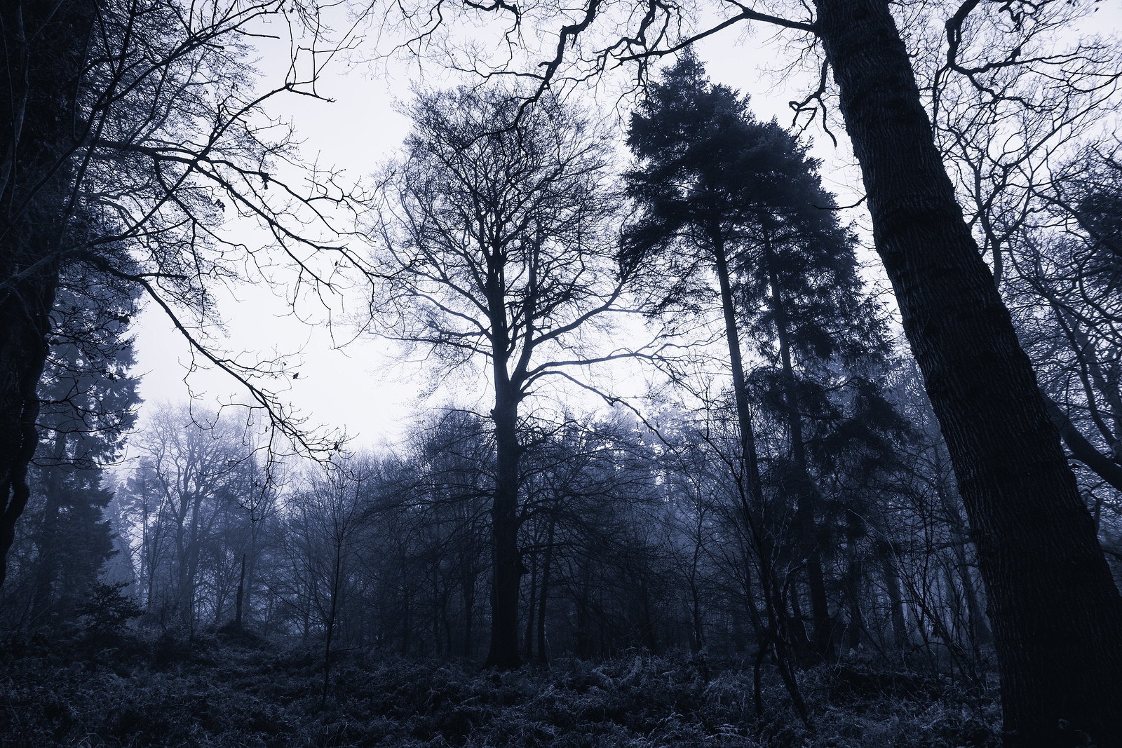
I use Flickr’s own embed code, choosing the “Large” 1600 width image. The reason for that is that on desktop, I want the photo to look nice and big. While it’s not full-width, it’s pretty wide. And if you have a retina-style display, the photo should appear nice and big.
The embed code uses some Flickr JavaScript to ensure that the image is resized appropriately in a “responsive” manner. In other words, rather than being a fixed width, it will display smaller for smaller or mobile screens.
The problem remains, however, that in the background a 1600 px width image is loading. That’s slow and is impacting on Google’s assessment of my site.
I could embed a smaller width image. The one below is 800 px wide.

But this is going to look a bit rubbish on a smaller screen.
I can also adjust the embed code so that JavaScript isn’t loaded.
But while that helps with lessening the amount of JavaScript and is perhaps something I’ll do in the future, it still doesn’t help with reducing the size of the base image (1.2MB).
And if you’re viewing this on mobile, then all three images will probably look identical. But that’s the problem. You only need to see, perhaps a 600 px image.
I’d love to be able to load only large images when the display is big, but a smaller version if the display is more modest. And while there are plugins for WordPress that allow this (e.g. WP Retina 2X), they’re based on loading from your WordPress install, and not a third-party location like Flickr.
So I’m a bit stuck. My site, but it’s nature, will have large photos embedded, but I can’t find a way to make them look nice on large displays, but in particular, shrink the page-loads for those viewing on smaller screens.
[Update] Thanks to Em in the comments below, I’m trying to usesrcset to see if that helps. See my next post here.
Comments
5 responses to “Failing to Optimise This Site”
Hey Adam,
Though there’s always a lot of arguing on various forums about what’s right, for now I think the correct way to do this would be to use the srcset attribute. I’ve been working a bit with srcset in WordPress recently (they introduced support for it in 4.4 I think) so your post intrigued me.
It seems you’re not the only one who’s been after a way of easily fixing this problem (ie. a one-click WP plugin which allows you to embed responsive Flickr images):
https://github.com/hiddentao/wp-flickr-embed/issues/15
https://wordpress.org/support/topic/feature-request-srcset-support-for-responsive-images/
Reading that it seems the various sizes Flickr creates for an uploaded image don’t have enough consistency in the file name for it to be something which is easily implemented.
I did find this though, I haven’t tried it out, but it might be worth a look: https://www.npmjs.com/package/respondr
Hi Em,
Thanks for that – that’s incredibly useful information.
Respondr does indeed look interesting, but it’s perhaps a little too much of a hack for me right now.
However using srcset looks like it might be the way to go. It’ll be a little fiddly getting all the various file versions from Flickr since as you say, they don’t seem to have a consistent naming structure. In particular the 1600 and 2048 width filenames suddenly divert from a standard structure. I’m sure Flickr has a good reason for doing this.
Anyway, I think I know what I need to do, even if it’s a bit around the houses at the moment. Hopefully someone will package together a nice and easy WP plugin that will work for me. In the meantime, I’m going to have a play…
[…] Yesterday I mentioned that I was struggling with embedding properly responsive images that will go lovely and large if you have a nice big screen, but only download a small image if that’s all I need. Added to which, I use Flickr to host all my images for me. […]
Fascinating. All I do at this point is add Flickr img tags to my blog these days with pretty high resolution so this post incredibly interesting to me. And while my site on mobile _appears_ to load fast when I view on my phone, my score from Google is abysmal. Will be digging into everything you’ve written here.
Glad to help Kevin. Do check out my follow-up which explains a fiddly way to only load an appropriately sized image for the screen its destined for.