I find few things more annoying than thoroughly misleading infographics. At the weekend, I was flicking through the latest copy of The New Statesman, and came across an advertorial published by Western Union addressing overseas trade.
The most startling part of the two-page spread was an infographic showing the top UK export destinations.

Now leaving aside the suggestion that WU Edge seems to present itself as the main route for this trade to be taking place, the most startling thing that instantly struck me was the scale of the US compared with everyone else. The size of the circle is significantly larger than any other circle on the page.
But hang on. If the US is worth $66.5bn, and Germany is worth $46.4bn (about 70% of the US), why does the German circle not look like it’s about 70% of the US one?
Let’s find out.
First of all, there are sometimes optical illusions, so I took a ruler out and roughly measured the diameters of the circles on the paper. (All more measurements and calculations from here on are a bit rough, with lots of rounding. However, the principles are correct.)
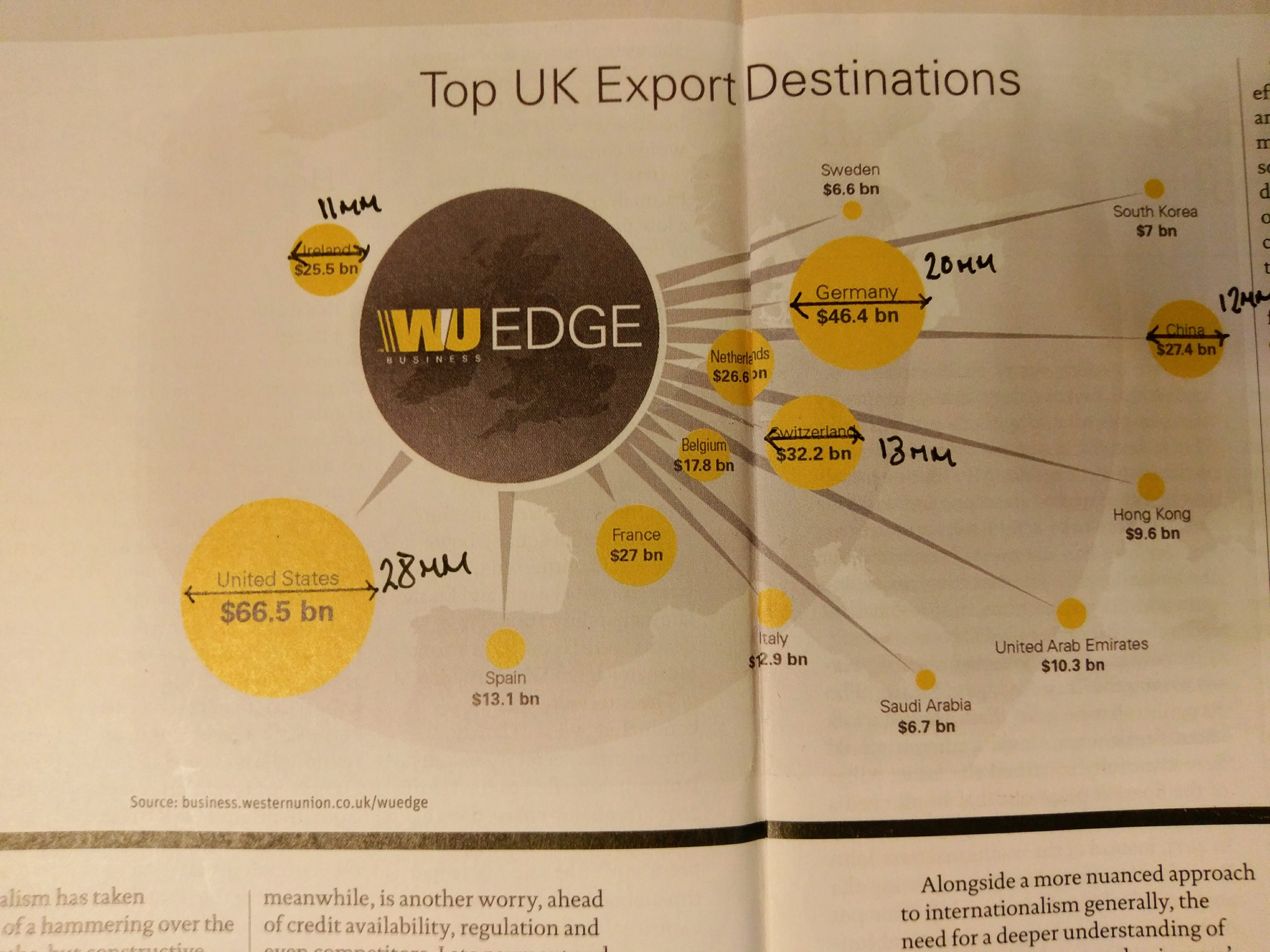
So the US circle is 28mm across, whereas Germany is 20mm, Switzerland 13mm and so on.
My suspicion is that they’ve sized these circles according to diameter or radius rather than area. Let’s see if I’m correct. Bearing in my mind I’m measuring roughly, here are my results:
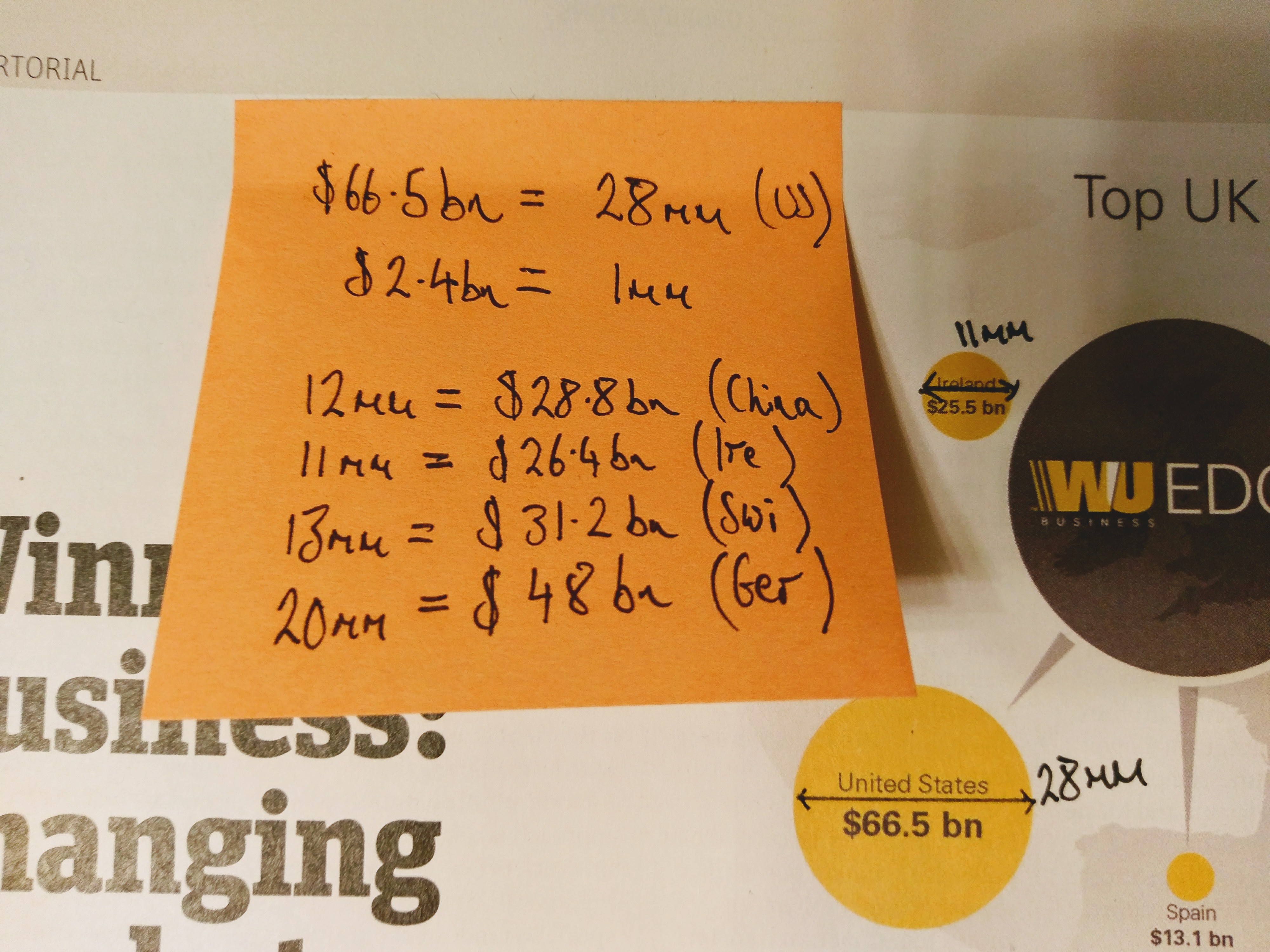
If we assume a diameter of 28mm is equivalent to $66.5bn. then you can see that broadly speaking the other widths are in line with the printed numbers on the page give or take the odd billion.
But that’s a wrong way to do things!
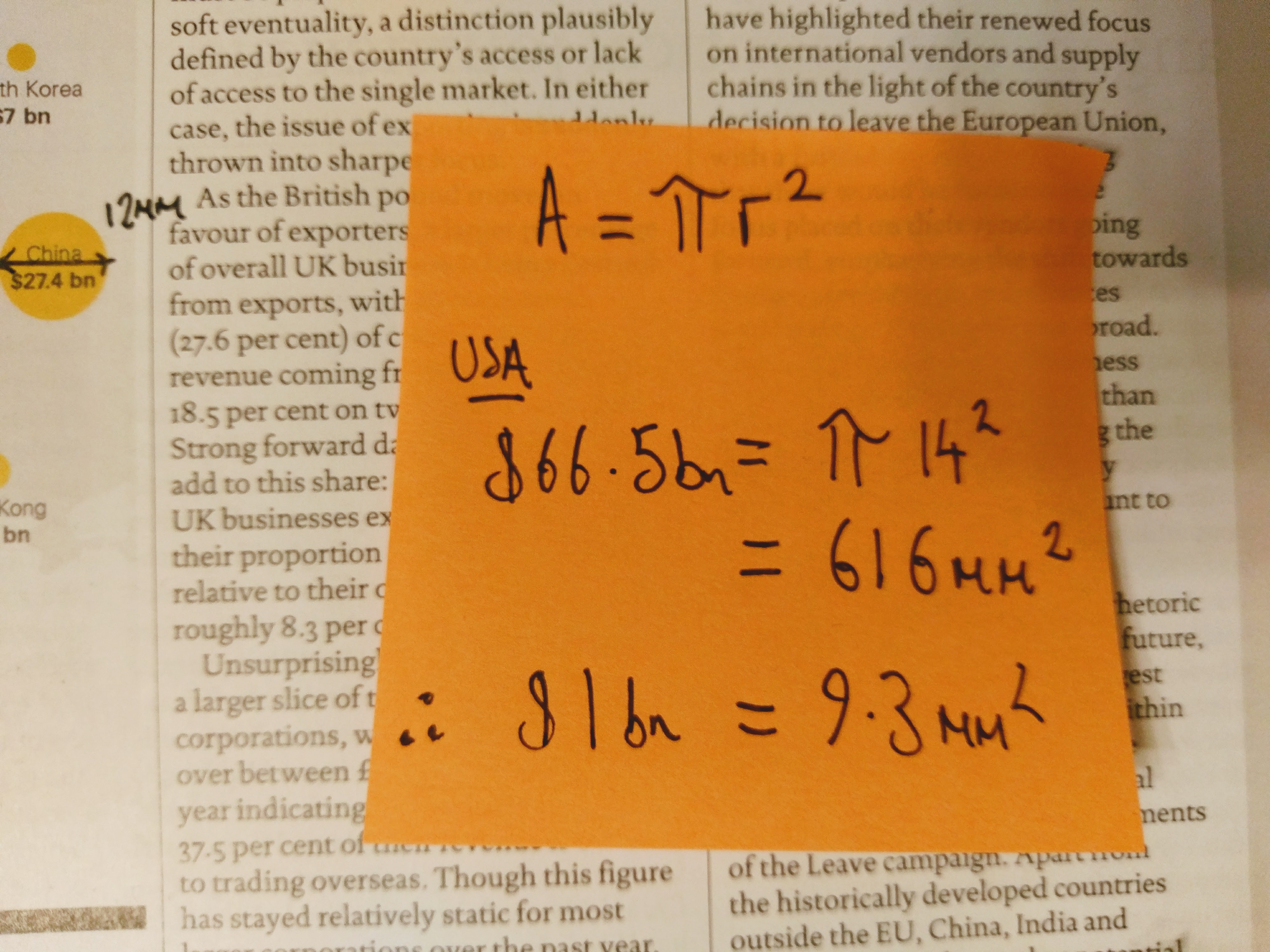
If we were being presented with a bar chart, then the length of the bar would be fine. But we have circles here, and if we use radius (or diameter) as our measure, then the area increases exponentially. That’s because, as any schoolboy knows A = Πr2 (or Area = Π x radius2).
To show how this misleads, consider the US circle. The area of that 28mm circle (14mm diameter) is 616mm2.
That implies that $1bn = 9.3mm2.
But if we work back from that, then Germany’s circle should be 23.4mm rather than the 20mm it actually is.
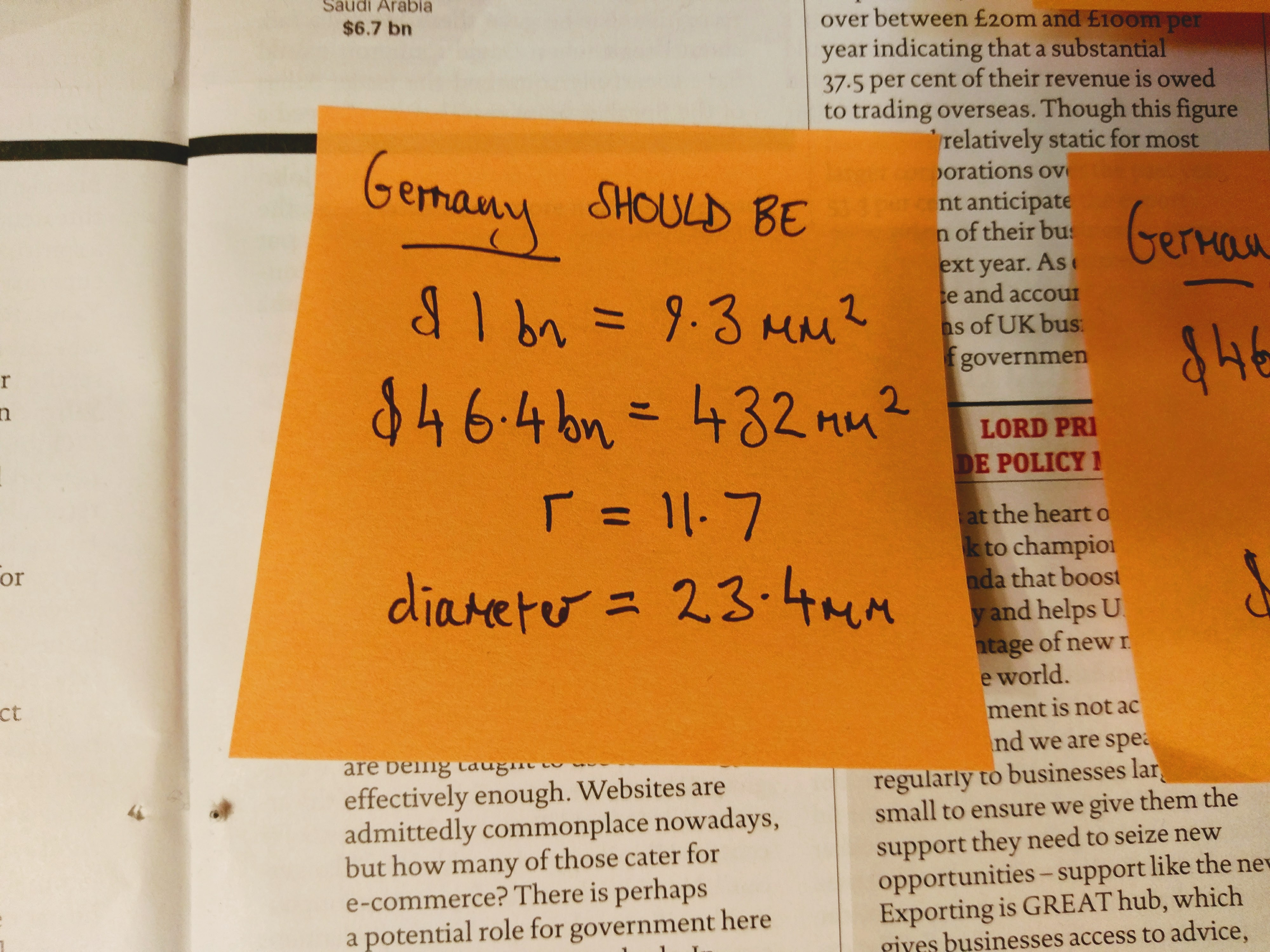
That might seem a small difference, but with a circle it’s suddenly larger as this hand drawn (no compasses available) image shows.
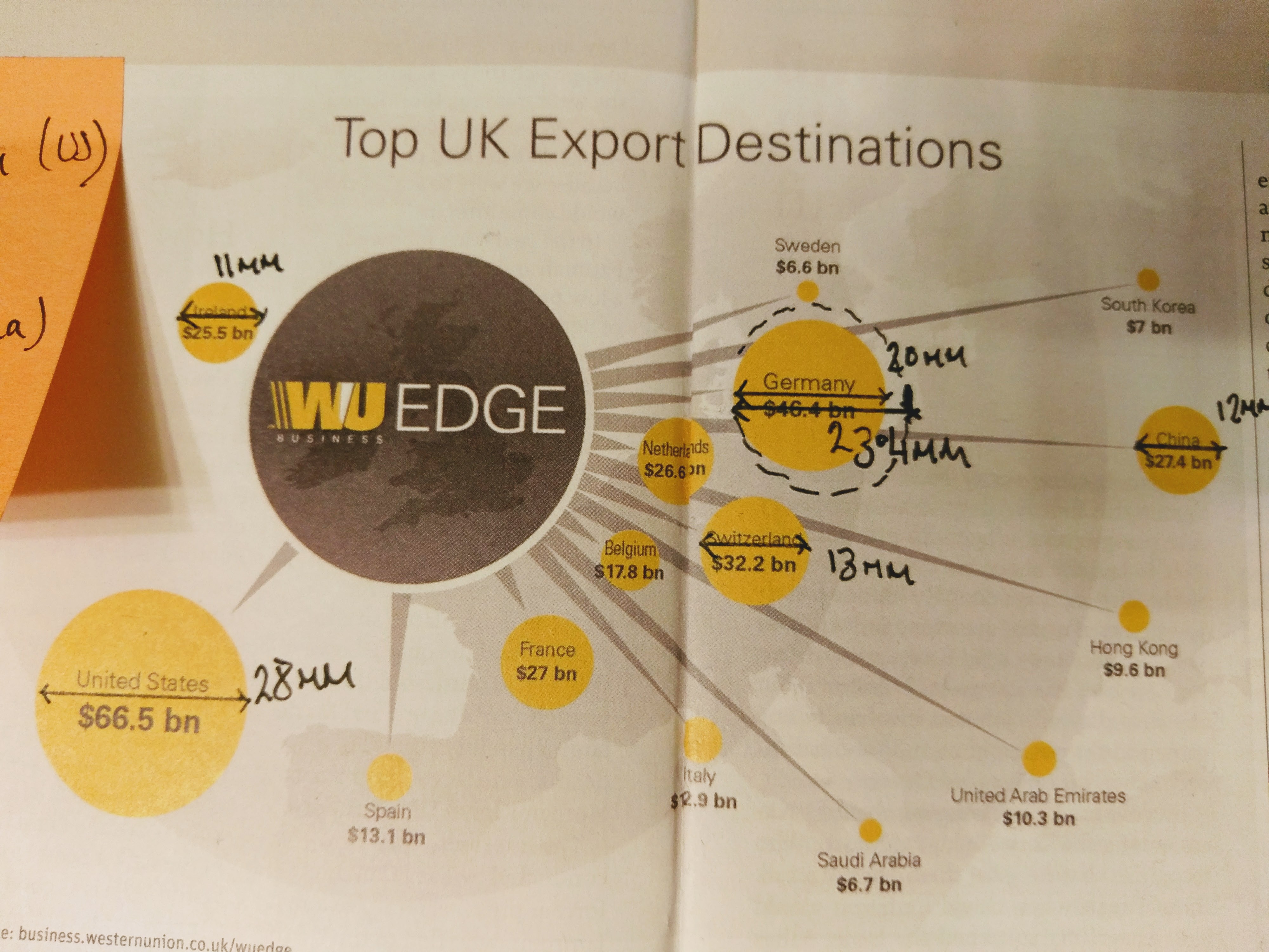
More to the point, if you take a smaller example like China which in the printed chart has a width of 12mm, the calculations show that is should have a width of about 18mm.
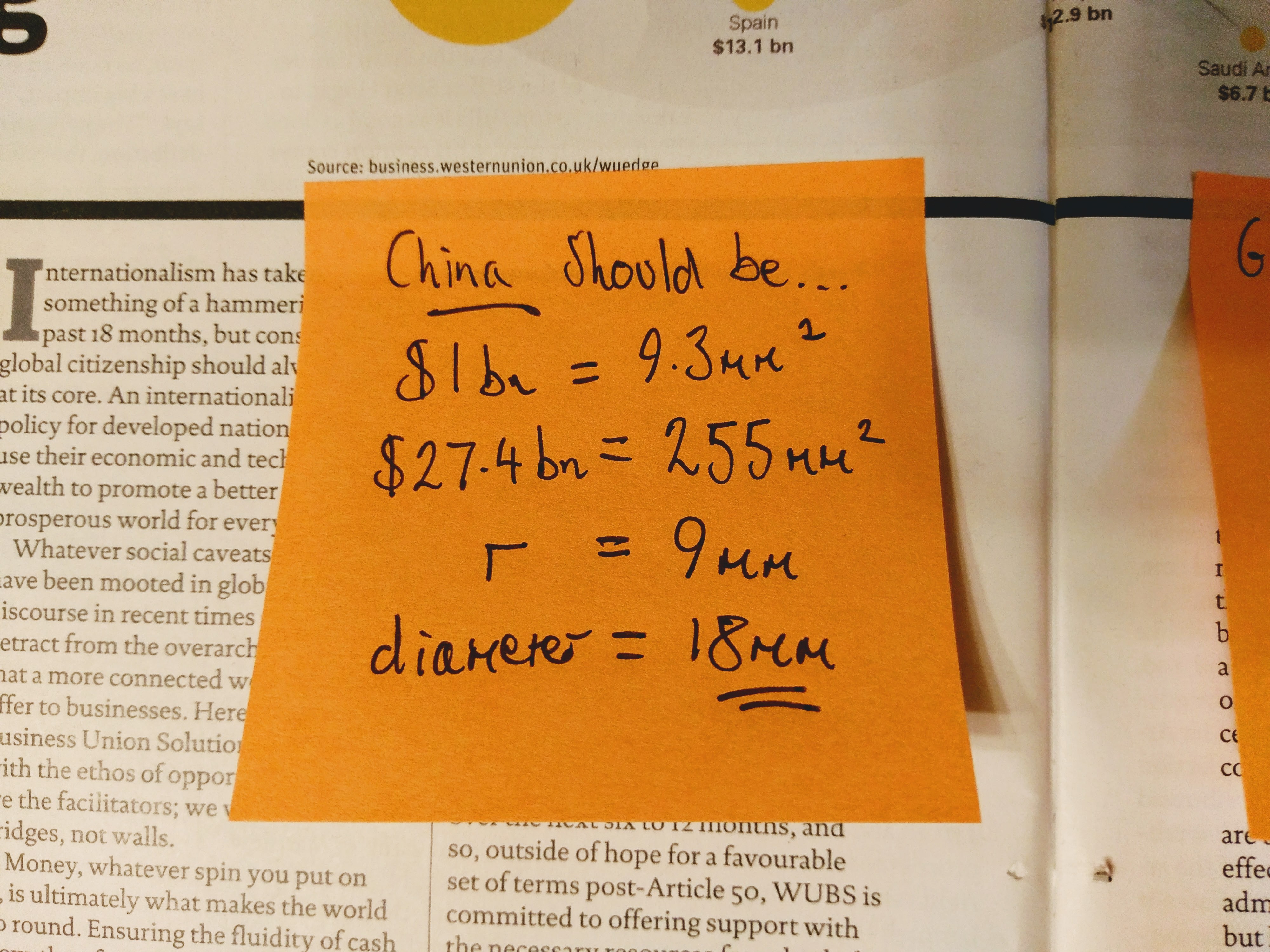

An 18mm circle compared with a 12mm circle is significantly larger in appearance.
I’m not saying that anyone politically wanted to make the US look larger than the other countries, but misuse of circles, not taking into account radius, actively makes that impression.
Infographics are great, if they handle data responsibly.
This was a bad example and as a consequence presents a highly misleading picture.