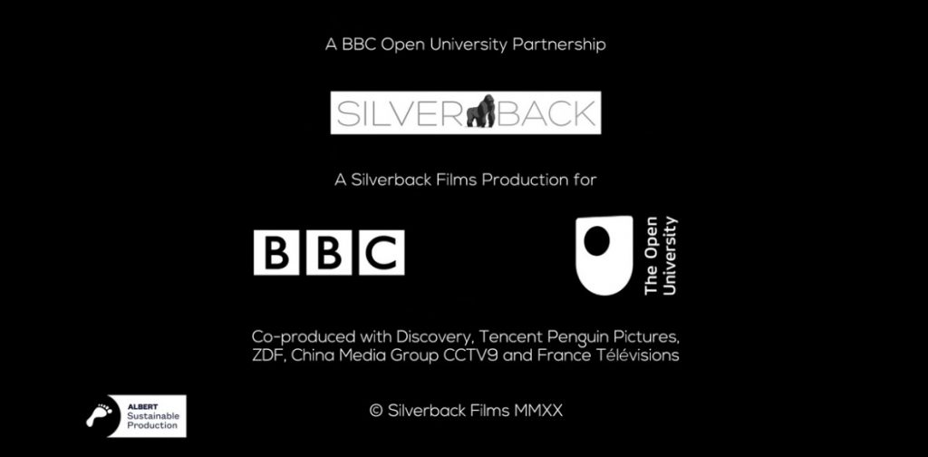
Far be it for me to suggest that some elements of TV production deliberately obfuscate information, but here are three things that appear daily on UK TV, but which many – perhaps most – viewers simply don’t understand.
There are different reasons for each of them, but they both put information in plain sight, while at the same time not making entirely clear to viewers what information they’re conveying.
Product Placement

This, for me, is the most egregious in presenting some information to viewers, but not really telling the viewers at all, but it’s an Ofcom requirement and not down to the TV companies.
Product Placement is defined as being when companies pay a TV production to include their products or services in that production. That could be gameshow prizes, or a coffee machine that sits in-shot on the set of a discussion programme.
Ofcom has its Broadcasting Code that regulates Product Placement and they insist that broadcasters use this image, or a variant of it, at the start of programmes, and at the start of segments that feature Product Placement segments.
So you will see it overlaid during opening credits or coming out of ad-breaks. But I defy anyone to tell me that viewers truly know what the “P” means.
Compare and contrast with YouTube, which clearly alerts viewers to any video that “Includes paid promotion.”

Although I should note that I certainly wouldn’t hold up YouTube as being wholly virtuous since it relies heavily on users policing themselves and being honest about whether they were paid or not to say something. But it least they’re a bit clearer about it.
Product Placement on British TV has been around since 2011, although it previously existed on imported TV and in films. Some 2018 research by TRP Research found that awareness was very low:
Just over half of viewers (52%) are even aware that it is legal in the UK and only 27% have noticed product placement in a UK TV show. Although 30% recalled seeing the P symbol that denotes placement is coming up in the proceeding show, only 22% knew what the symbol meant.” [My emphasis]
That’s not great, and gives the “P” Product Placement logo top spot in my list.
Albert Sustainable

Now this is actually a very good thing for a production to be doing. It’s just that I don’t think most viewers will have a clue what this logo means when they see it at the end of TV credits.
Albert is a group that is there for the TV and film production industry to help them make environmentally sound decisions in their output. Their two main objectives are:
- Inspire; empowering the industry to create content that supports a vision for a sustainable future
- Restore: enabling the industry to make positive contributions to the environment while actively eliminating waste and carbon emissions from production
Those are both great ambitions. As part of their work, they certify productions to have reached a standard in their productions. This is ongoing work. Productions that achieve those standards can include the Albert logo in their credits.
My only real issue is that this is all very “inside baseball” for the TV production industry. Viewers don’t really understand what it means. Who is “Albert”? Uncle Albert? Prince Albert? The word “sustainable” may give a clue, but essentially you’re asking your audience to Google their logo.
Broadcasters like the BBC, ITV and Sky have quite strict limits on what can and can’t appear in credits, with the Albert logo being one of the few images to make it through beyond TV production company logos. It might just be a good idea to let viewers in on it too!
Roman Numerals

TV broadcasters love to use Roman numerals in the copyright notice of a production.
There’s no real reason for this, although there are two common beliefs in why it started, and why it prevails.
Firstly, that it was used to hide the ages of productions from viewers. A copyright that included the year needed to be included in the show for various legal reasons (although not necessarily in every territory). But if you make it really obvious that your show dates from, say, 2015, then viewers might be less inclined to watch it because it’s “old.”
So for years everyone has used Roman numerals. And while it doesn’t take a genius to work out that MMXXI means 2021, decoding MCMLXXXVIII as 1988 is somewhat harder. While I’m sure the readership of this blog are pretty au fait with this kind of nomenclature, knowing Latin numbering is not something that most of us need to know on a day to day basis.
The other reason for continuing the practice is because, er, that’s how it has always been done. That said, some productions do include their year of copyright in the “clear”, but big name productions still frequently use the Roman numeral format.
Summary
So those are three logos or indicators, that many of us see every day on TV, yet are there for often quite opaque reasons. Are we really letting the viewers in on what these mean? I’m not so sure.
I think the words “This programme contains Product Placement” would be more meaningful to viewers than a “P” logo. The Albert certificate is fine, but perhaps some kind of coda could be added to it, the way that in the US, the American Humane Association which certifies productions that use animals says, “No Animals Were Harmed” alongside their logo. That’s pretty definitive. And maybe, it’s time to ditch Roman numerals in our production credits?
Note: Readers with longer memories might recall that I wrote about Product Placement and the lack of viewer awareness back in 2016.

