
This year was the fifth edition of The Podcast Show in London, and I have been to all of them. In fact, I have spoken at three of them, including this year when the subject of my talk was Signals in the Static: A Data-Driven Guide to the Podcast Landscape.
The objective of the talk was to take a data-led approach to examining trends in podcasting in 2026. I also wanted to present some techniques that anyone could use to explore the podcasting landscape.
The full presentation is below and is available to download. But I’ll also dig into some of the slides in this post, so read on.
What I was trying to do with this presentation was to use the Edison Research Top 25 UK podcasts as a basket of podcasts that showed current trends in podcasts. There are challenges with this, not least that they are the biggest podcasts in the country are certainly not representative of podcasting as a whole. But it can informative to see what’s going on.
Note on how I did much of this research: I used Google Gemini AI to “vibe code” a lot of Python to run many of these analyses. Essentially, that means writing in regular English what you would like the code to do, then using a command prompt on your computer to run the code, and outputting the results usually to something like a CSV file. This kind of coding is very powerful now, and most of the main AI companies have offerings that allow it. You do have to check the results and sometimes need to iterate the code to get it to do what you want. But for someone like me who knows what they want code to do, but can’t actually write the code to do, it’s an incredibly powerful tool.
Here is a look at how long the Top 25 podcasts run.

I used the previous 50 episodes to run this analysis.
The solid bar in the middle of each row of this chart shows where 50% of the shows lie in terms of duration. At the top we have 50% of Joe Rogan’s shows being 150-170 minutes roughly speaking. The white line in the middle of that block is the absolute median of those durations. The “whiskers” or side-bars coming out of the sides show the expected range of the rest of the shows, but the small circles are statistical outliers that don’t adhere to the usual durations.
What this chart shows is that most of these podcasts are pretty consistent in length. The two notable titles that don’t adhere to this are Diary of a CEO and That Peter Crouch Podcast. The former, because they release shorter episodes and a long episode each week, with the long one potentially going very long, and the latter because that’s how they do them. At the other extreme are some of the BBC Radio shows like The Archers which have to hit a precise duration so there’s not any deviation from that duration at all.

Something else I looked at was the number and make-up of podcast hosts. Across the 25 podcasts in the list, there were 54 regular hosts – an average of 2.2. per show. But 72% of them were male.

The average age of those podcasts’ hosts ranged from 31 for Alex Cooper of Call Her Daddy to 60.5 for Rory and Alastair on The Rest is Politics.
I would like to explore ethnicity too, but that’s more complicated as I’d want the hosts themselves to decide on their ethnicity. It’s not something I feel I can attribute myself. I think this does bear exploration though.
Using Transcriptions
Over the last couple of years, many of the most popular podcast apps have added transcriptions to their offerings, either using ones provided by creators, or generating their own via AI. In the following examples, I only used a single episode of each the Top 25 podcasts to create these results, but a better use would be do take multiple episodes of a particular title or set of titles, and run an analysis based on that. I used transcriptions provided by Pocket Casts as I was able to easily access and export these from the app. I have a premium membership that provides this facility.
There are also third party companies that offer paid options to create transcriptions of audio, and using something more detailed you could identify different speakers and run analyses based on who says what.
Nevertheless, here is the sort of thing you can do. You can create a simple Word Cloud of the most commonly used words across the entirety of the Top 25.
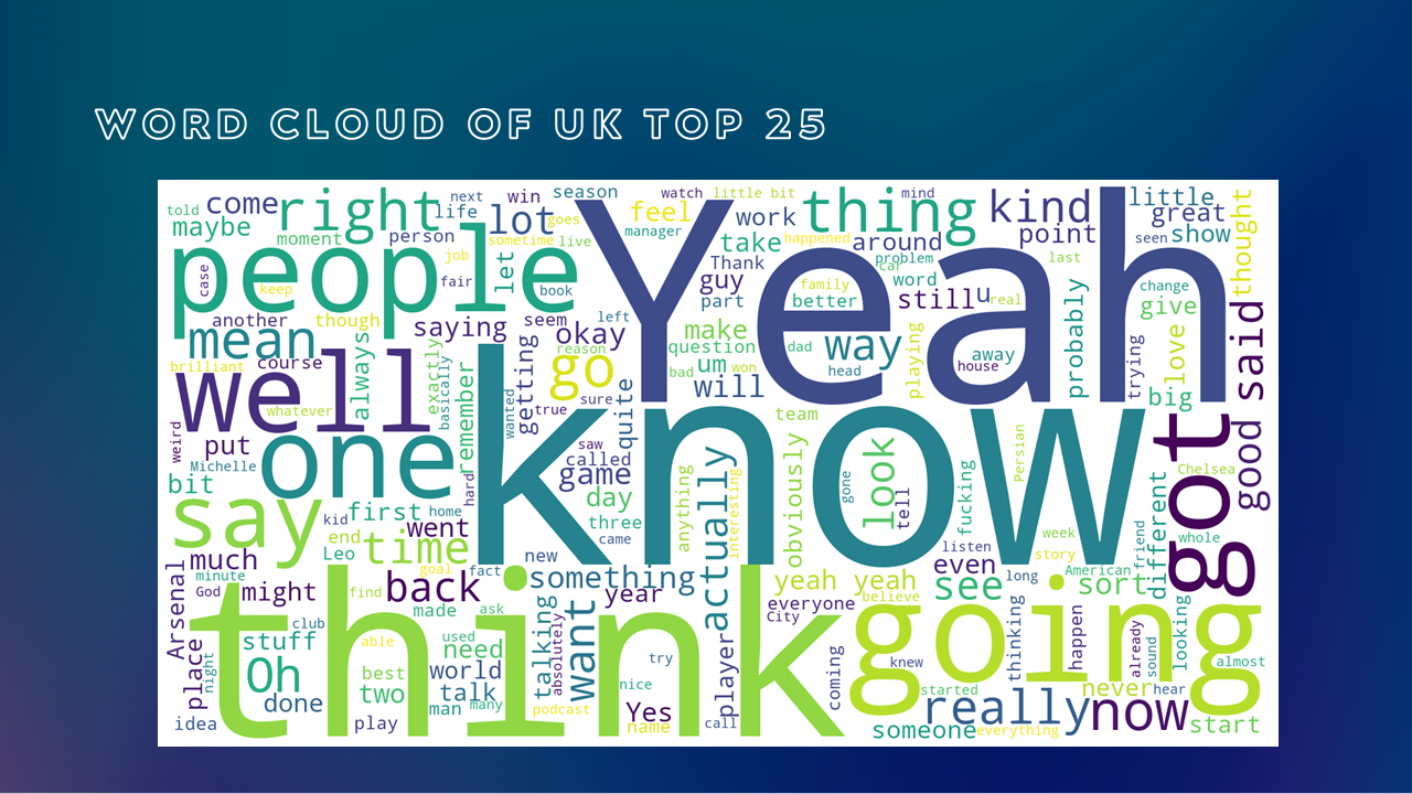
Yeah – know – think.
On the other hand, if I look at the specific episode of Newscast published just after the May 2026 local elections, we get something a bit more illuminating.
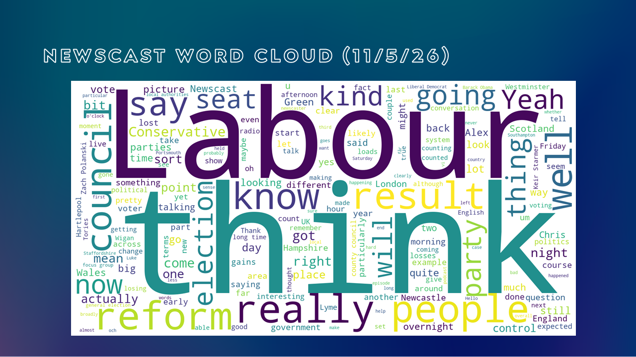
With Labour doing badly in the recent elections, that was the key thing they were speaking about. Reform is quite big, while Conservative and Green are smaller.
But something else that you can do with transcriptions is carry out sentiment analyses. I used something called TextBlob, an easy to use library in Python that categorises language for precisely this purpose. Again using a single episode of each podcast, we can show Positivity vs Negativity on the x-axis, and Subjectivity vs Objectivity on the y-axis.

To be clear, all of the language in these podcasts is “Positive” with the 0.0 line far over to the left and the overall scale being -1.0 to +1.0. But in the top right hand corner is The Rest is History which is both very Positive and very Objective. On the other hand, the true-crime podcast RedHanded is more negative and more subjective. And there are a lot of Subjective words used in the edition of Americast analysed. That’s not to say that these programmes are themselves subjective – just the words used. For example, they might be quoting politicians on the show who themselves use subjective language.
More than this, you can also examine the “Emotional Arc” of an episode or a particular show. You chop the transcript up into batches of, say, 500 words, and look at those batches in isolation, with the x-axis being time.
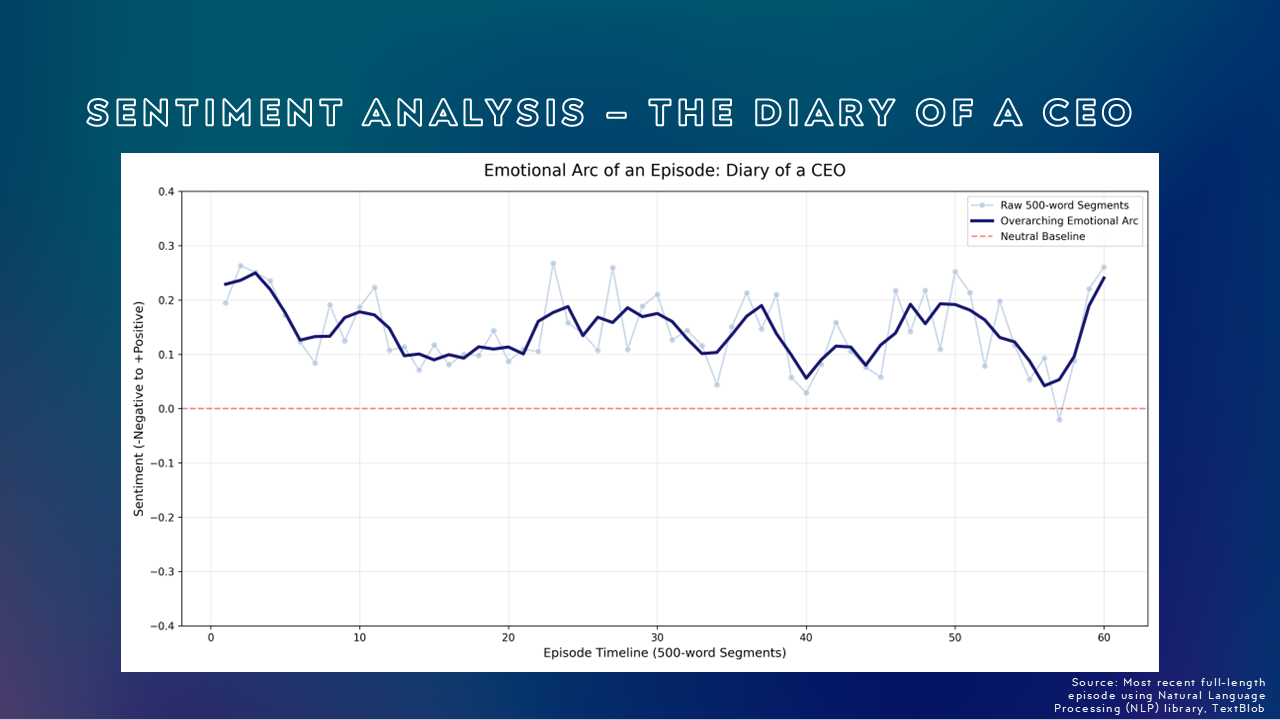
Here is an episode of The Diary of a CEO with Steven Bartlett and it shows that overall this episode was pretty positive throughout. But while it dipped towards a more neutral position later on, it rose and finished on a high note of positivity.

Whereas this episode of Stick to Football drifted downwards over the course of the episode, finishing, if not negative, then certainly not positive. But with a football discussion show, you’re going to have a range of views!
Having a transcription and the duration of the audio, we can also work out a Words Per Minute measure.

For this, the script I created used Active Speaking Time (so it removed music etc.) and looked at how many words were spoken per minute of the episode.
At the bottom we have The Daily which most listeners will know is fairly measured in tone. And at 142 words per minute, it falls right in the middle of what is common for conversational English (130-150 words per minute).
However, at the top is Stick to Football which I should note has five hosts talking about football. Between them, they talk for 232 words per minute which is a lot. Indeed, all the other titles in the Top 25 are all faster than regular conversational English.
We can also look at silence.
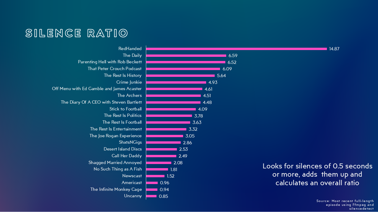
For this, every section of silence over 0.5 seconds in duration is added together and then considered as a percentage of the overall duration.
Again, The Daily has thoughtful presenters who take a beat between sentences, and pause between answers and asking the next question. I would note that a show like Uncanny is probably near the bottom because it has music beds, while other podcasts near the foot of the table have things like studio audiences that keep things “noisy.”
However, the true crime podcast, RedHanded is right at the top and a real outlier. I actually thought something had gone wrong until I listened to the episode in question. There… are… a lot… of pregnant… pauses in that episode! I actually ran another episode through the system and got an even higher percentage!
Then there is overall loudness measured in LUFS.

Different podcasting companies specify different levels of loudness, but somewhere between -14 and -18 LUFS is what Apple and Spotify are looking for. This just means that loudness is consistent, and listeners don’t have to adjust their volumes much between podcasts.
In this chart, I’ve taken a 5-show average to compare loudness, and then ranked the shows from quietest to loudest. Yes, Joe Rogan really is the quietest, while The Rest is History guys are the loudest! At both ends of the list, some audio tweaks probably need making.
Video
With major camera manufacturers like Sony and Canon having a major presence at The Podcast Show, video was never far from any of the discussions.
I thought it was interesting to see which of the current Top 25 podcasts are on what video platforms. And for this, I mean every episode, not occasional or one-off episodes.

While Apple is obviously quite new to this, with their offer only recently being announced, it is notable that a lot of podcasts that make episodes in a video format do not publish them on every outlet. And to be honest, that’s probably for business reasons a lot of time.

I’ve talked about this before and used a version of this chart previously. But placing videos on YouTube and Spotify means ceding sales to their companies in most cases, while the current situation with Spotify means that uploading videos to Spotify can break your dynamic audio ads in the platform! I’m sure that this will be fixed in due course, but the fact that it isn’t today is an active reason for not uploading to that platform for businesses not using Spotify/Megaphone to monetise their podcasts. With Apple Podcasts, it’s more a question of getting the tech working, although I should note that devices that can play video on Apple Podcasts do get the audio versions of the video (so no separate audio and video versions of a podcast except on older devices that can’t stream HLS), and it requires the dynamic advertising creative to work both in audio and video simultaneously. It’s all a single HLS stream, and that does mean that there is a creative challenge for many types of advertising.
The other thing to say about video is that it, for the most part, does not achieve the same CPMs as audio gets. There are of course, many positives about video – not least the discovery that it brings, with YouTube and TikTok being much better at surfacing things that you’re interested in than the average podcast app. But money really isn’t one of them.
Colour
I also thought I’d look at colour, taking a basket of the top 100 UK podcasts on Apple Podcasts.
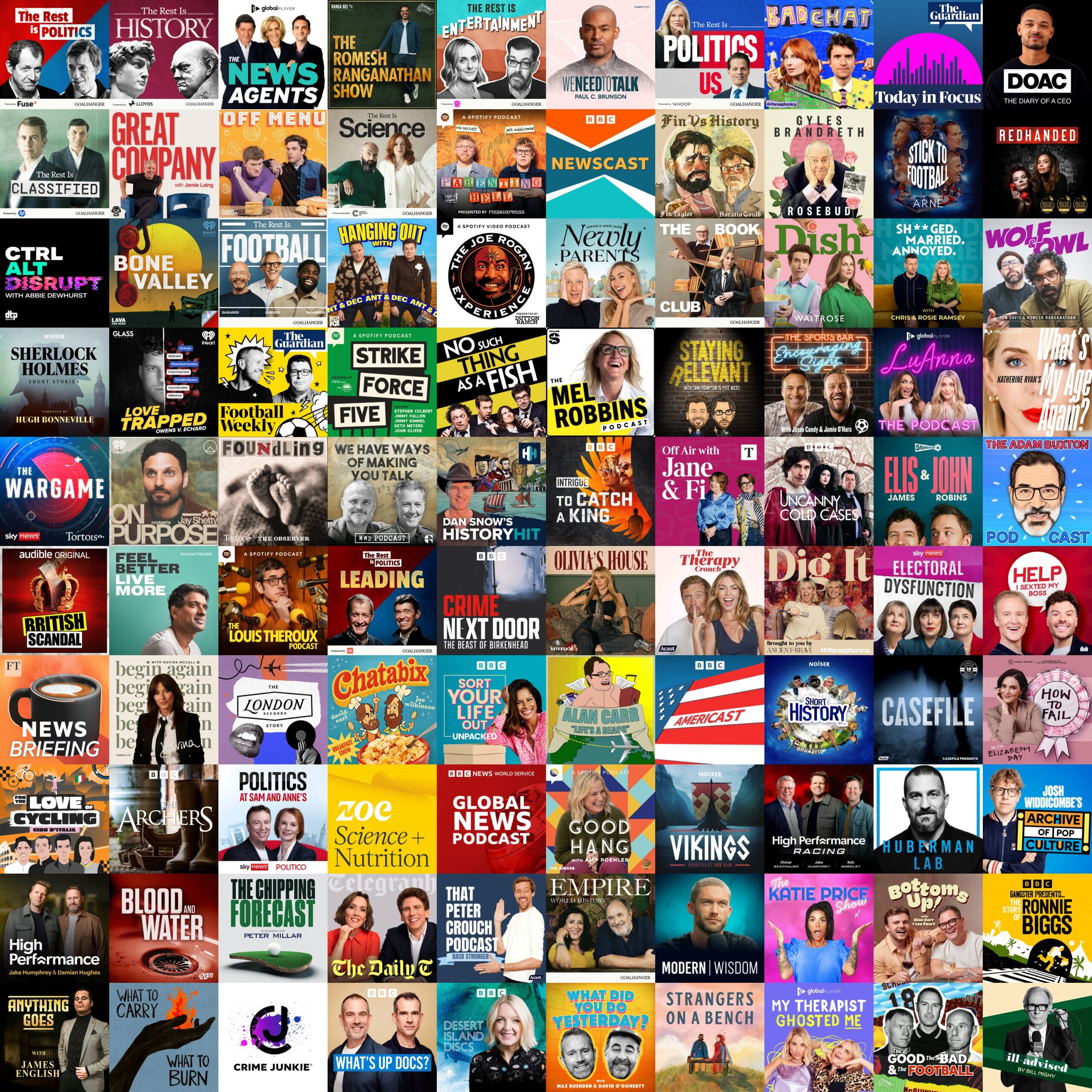
Using computer vision, I can break this down into primary, secondary and tertiary colours in each of these cover art images.
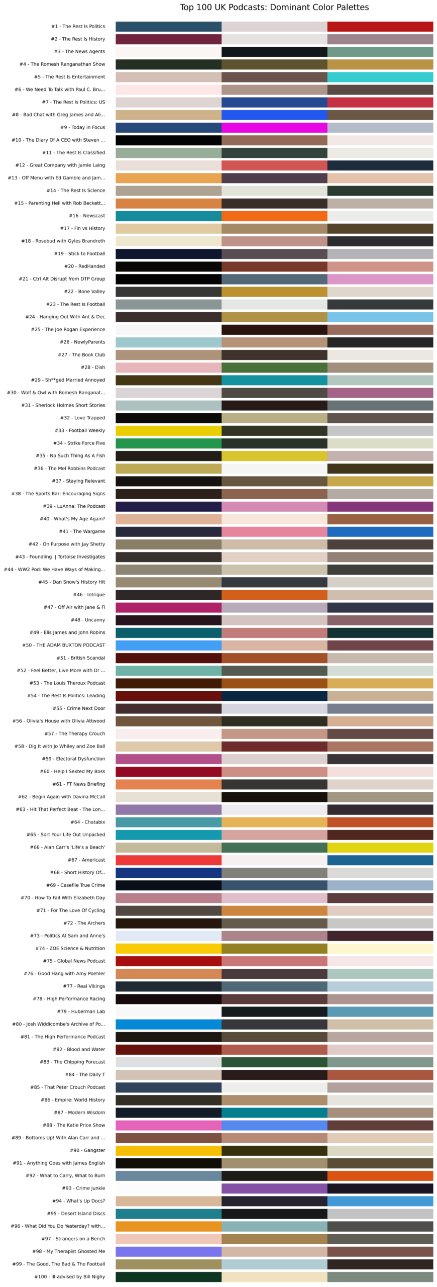
From there, I can use something called Agglomerative Clustering to simplify down those colours and find out what’s “On Trend” in cover art.
And the answer is…

Beige…
Oh well. Not everything is super-useful.
Summary
Hopefully I’ve shown that there are some interesting techniques and ideas for looking at either your own podcasts or your competitors. All of this can be done at no cost using open source software, AI engines, and a bit of technical knowledge – mainly installing Python, the various libraries and knowing how to run it. YouTube videos and the AI engines themselves are very useful for this.
Do feel free to get in touch if you want to know more.
Leave a Reply